
Do you know if the colours in your PowerPoint deck are company approved?
Almost every company will have a branded PowerPoint template. Something I recently saw takes this to the next level: adding a colour palette.
Why? Well, companies will almost always have a branding guide that specifies company colours. However, outside of the marketing department knowledge and access to this information may be limited.
By including a colour palette in your slide template, employees will be able to easily choose from company approved colours. This will help keep your brand consistent across your business.
Creating the Palette
First, you’ll need to get your brand guidelines so that you can identify and select your company approved colours.
Second, you’ll need to open the Slide Master of your presentation template to create the palette there. This ensures that the palette will be on all newly created slides. As a note, the completed palette must be placed on each master slide to be seen – that is, if you have multiple master slides you need to copy the palette to each one.
Also, you may wish to exclude the palette on any master intended as a cover page since you don’t want external audiences seeing the palette if someone forgets to enter presentation mode.
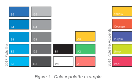
Creating the palette is simple (I suggest using rectangles, but feel free to be creative). Create one shape for each colour, then fill the shape with the approved colour. Group shades of the same colour into rows and make the shapes big enough so they are easy to hover over with the eye dropper. You can also include some text relating to the name or properties of the colour.
Here’s one I created:
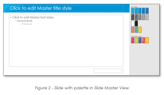
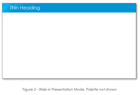
Place the palette off screen. Either left, above, right, or below the slide itself. This ensures that the palette will not be seen in presentation mode.
Here is a side-by-side of the slide master compared to what’s seen in presentation mode:
Set your Font
While you are at it, remember to set your fonts on each Slide Master if you haven’t already done so. This will ensure that all users start with your company fonts and that your preferred default header and body font are found at the top of the font list.
To set the Font on each Slide Master go to the Menu and choose the “Slide Master” tab and then look for “Fonts.” Choose the fonts that are specified in your brand guidelines.
Similar to the colour palette, this must be set on each master slide if you have more than one master.
Set your Colours
Finally, I recommend setting the colours for all your Slide Masters. This will ensure users can pick approved company colours within the Theme colours. There is a limit of 10 available colours to set for your Theme so you may not be able to add all of your accent colours.
I suggest choosing the primary colour of each colour type e.g. one blue, one grey, one green, etc. This will provide your users with a better default palette theme.
Don’t forget to set the theme for each master slide.
Conclusion
Using the colour palette and the other tricks listed above can make a big impact on the quality and consistency of presentations created by your company.
It will make creating on-brand content much easier and may even speed up creation of some slides since fonts and colours won’t have to be chosen for each new text box or shape.
Hope this helps!